Think back to when you’ve bought something online (and if you haven’t bought something online…it’s 2014, what are you waiting for?) After viewing a product’s details page, normally you click an “Add To Cart” button, then click another button to proceed to checkout, so on until you were complete.
What about the time you signed up for the newsletter to be emailed to you? Did you fill out a form with your name and email address? These are all great examples of a Call To Action, or CTA, and they can be a very effective tool for your website.
What Is A Call To Action?
A Call To Action, or a CTA, is quite simply something that you want the visitor to do while on the page. In a more strategic explanation, it’s an objective that you want a person to engage or complete. CTAs can come in a variety of forms, from obvious to less obvious. Downloading an e-book, registering for a webinar, buying something online – these are all great examples of a CTA on a website.
It’s worth noting that designing CTAs can have a profound effect on increasing conversions online. If visitors can’t immediately locate your CTA, or it’s not prominent enough, or obscured by page noise, your efforts can be poisoned and need to be addressed.
Let’s explore different types of CTAs to become familiar with them.
4 Homepage Call To Action Examples
Putting a Call To Action on your homepage is a great way to convert visitors. Many times visitors will need more information before contacting you, but having a CTA prominent is memorable and impactful for visitors.
Below are four different homepages from popular sites on the Internet, and each with a different Call To Action. Notice the difference in the sites and how each Call To Action is set up for the visitor to view and interact with.
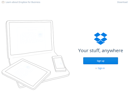
CTA Example 1: Dropbox Homepage

Dropbox is a freemium file synchronization service, and their homepage is extremely simple – it has a large CTA titled “Sign up”.
Clicking on this Call To Action, you’d expect to sign up for the service. This makes sense, since that’s the main point of their service is to acquire new users and get them onboard quickly. It’s direct, simple, and very quick to the point.
Of course, visitors are able to scroll down the page for more information if needed, but having the CTA first and foremost makes it clear that’s the goal of the site.
CTA Example 2: Evernote Homepage

Evernote is an organizational tool, and their homepage has slightly more design than the Dropbox homepage. A brief explanation of the service, an image of a person, and things that have been supposedly organized by the person with Evernote decorate the page.
The prominence of the “Sign Up Now” button and the ample whitespace make the visitor feel this is the action they are supposed to take. Similar to the Dropbox page, you can scroll down the page to view more information, but having the CTA at the top of the page creates importance.
CTA Example 3: GitHub Homepage

GitHub is a code management and tool site. Their homepage takes their Call To Action a step farther – they have put the sign up form directly on the homepage.
This is a great example of saving a visitor a click and showing them exactly what is needed to sign up with the service, rather than having them click to a separate page to load the same form.
CTA Example 4: You Need A Budget Homepage

You Need A Budget is a fantastic budgeting and checkbook register program. Their goal is to get users to sign up for their software with the “Try YNAB Free”, but the designers realized that visitors may need more information before they decide to enroll. For that, they have a second CTA listed, “Watch The Video”. This is a great way to warm visitors up – by showing them a demo video that explains how your service works.
Having two CTAs is possible, but it’s important to note that there should always be a primary CTA, and the secondary should assist with the primary. Continuing to use the example above, if we strip out the “Video” CTA, the page still makes sense, but visitors may not be ready to engage yet. Conversely, if we remove the “Try” CTA, the page still works with the “Video” CTA, but it isn’t as strong. Therefore, the “Try” is the primary CTA and the “Video” supports it.
4 Deeper Examples Of A Call To Action
Having a CTA on your homepage isn’t always feasible, and of course you should have CTAs across your site to help nudge visitors along, right? Let’s look at some other examples of deeper CTAs and how they work on other pages.
CTA Example 5: Amazon’s Add To Cart
 In our example above from the intro for an e-commerce store, let’s use Amazon.com’s product detail page. On this page, we can see product information and photos. Of course, the goal of the page is to get users to purchase the product. So, in the right column of the product detail page we can see our CTA – a very clearly defined, very obvious Add To Cart button.
Additionally, notice how the “Add To Cart” button is a contrasting and eye-catching color? That’s on purpose – CTA’s that have a distinctive color tend to perform better – we’ll explore more of that below.
CTA Example 6: Linode’s Plan Pricing

Linode is a hosting company, and their primary goal is to have users sign up. They include an obvious “Sign Up” Call To Action at the bottom of the plans.
The designers behind Linode’s site understand that users will want to compare the differences in the hosting plans, and so the designers want to make it easy for users to sign up immediately without the need to get distracted before signing up.
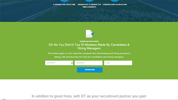
CTA Example 7: Decision Toolbox

Decision Toolbox is a recruitment company, and they use CTAs across the site to tease whitepapers, e-books, and their monthly newsletter.
In this example, the designer created an entire section to visually break up content and insert a CTA. This is a fantastic and useful way to keep content in sections (which can be useful in responsive web design) and allows visitors to digest chunks of information, all while giving them a way to get additional information via gated content if they desire.
CTA Example #8: Cloud Sherpas

Cloud Sherpas is a cloud migration company that helps companies migrate to cloud services.
Obviously in this scenario there is a lot of education that needs to take place, both before and after a user converts as technology changes rapidly. This example showcases a page where the user can download a report with information related to the topic. Again we see that putting the form directly on the page is a great CTA, saving the visitor a click to a next page, and letting the user see exactly what they will need to fill out in order to download the report as gated content.
3 Rules For Effective CTAs
Above we see different types of CTAs in various places, and they are great examples of what CTAs should be. Universally, effective CTAs tend follow three rules.
Be Clear And Concise With Intent
If a Call To Action button says “Click Here”, that is obviously where you want users to click – but what’s next? How would users know? Does the copy hint that there is a registration form? What if the copy isn’t clear what the next step is?
Be clear and concise with copy everywhere on your CTA (including actionable items). Use relevent images if necessary to help visually tell the story. Replacing the “Click Here” with “Sign Up” or “Download This E-Book” adds context that is sorely lacking.
Eye-Catching Design And Colors
If your Call To Action has a very bright, unused color scheme that differentiates itself from the rest of the site, you’ll win. If you make your CTA a text link at the end of a paragraph, you’ll most certainly lose. Make your CTAs stand out with design – break it out of the page, use contrasting colors, perhaps a photo, give it a button, and some accurate copy.
Reduce Anxiety
In the examples above, users were asked to click a button labeled “Sign Up”, or were presented a form with all of the required fields presented. This presentation is important – by immediately showing users what is needed to complete their action, users trust this is the full transaction.
If the same Call To Action were replaced with “On To Step 2” or “Next Page”, the conversions would likely suffer, since users are unsure about the next step (or steps) needed to complete the action. Few things are more frustrating to a user than giving personal information away to a form, only to discover the the site requires a second form with additional information. This creates frustration and anxiety with users and can make them abandon your site for good.
Use a soft touch when asking for information, resist the urge to get tremendous data from them, and if necessary, follow up at a future point.
CTAs Are Everywhere
Good web design includes CTAs as conversion points. By making sure your CTAs are clear, attractive, and honest you’ll find that users appreciate and engage them more often.


Leave a Reply