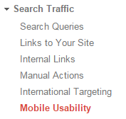
 Earlier this month, Google quietly rolled out a “Mobile Usability” section of it’s Google Webmaster Tools. You can locate this tool by logging into your GWT account, selecting any site, and expanding the “Search Traffic” dropdown. With this update, it’s clear that Google is now paying attention that sites that are willing to invest in mobile developement of their sites. But what about non-mobile sites?
Is Google Penalizing Non-Mobile Sites?
So far, no, it doesn’t appear that Google will penalize you for having a non-mobile site in the strictest sense. I think when the dust settles and the results are in from this mobile expansion, Google will promote sites that are mobile-friendly and/or responsive to users that are on mobile devices.
What this could mean is that if your site focuses heavily on mobile users for conversions and organic traffic, such as e-commerce sites, establishing a mobile friendly site should be a top priority (if it wasn’t already). This goes doubly so if your competitor sites are not mobile friendly, as this should start providing an early SEO advantage soon.
What Is Google Looking For?
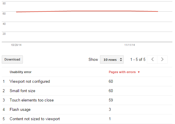
It looks like Google is monitoring mobile usability for a few things.

Viewport not configured
Every mobile device is different and has different screen size. This bit of code helps to adjust the site’s preferred viewing size to match the device’s screen. This should be an easy fix for most sites. See examples on Google of viewport and how to utilize it.
Small font size
If you have to zoom in or pinch-zoom to read the small font size on a mobile device, this flag for your site. If your site uses CSS, this should be an easy fix. If your site doesn’t use CSS, you should be ashamed.
Touch elements too close
This may be something that requires a redesign. If portions of your site are too close together and users will have a hard time engaging one button from another, you’ll be flagged.
Flash usage
This appears to be the death knell for Flash – if your site has it, Google will flag it. Most mobile devices simply don’t run Flash, and as a result, Google will flag it.
Content not sized to viewport
This flat means that you have content that requires scrolling horizontally to view, including images and words. Correcting this flag will require pages to use relative position and width in CSS. Images will also need to be corrected for mobile as they must scale too. Learn more about Viewport Content on Google’s Developer Site.
Fixed-width Viewport
This shows pages that have a viewport set to a fixed-width. The only way to fix this error is to move to responsive web design See examples of how to correctly set the viewport on Google’s Developer Site.
Get Started On Mobile Development Now
One thing is clear – Google is beginning to cull it’s massive data for sites that are primed and ready for mobile. All it takes is Google moving their needle from a 0 to 1 in this ranking factor and many, many sites will fall off of the radar, and many will be promoted. If a significant amount of your leads originate from organic search, contact your web development agency or in-house team to start the conversion and get an early jump on the competition.


Leave a Reply